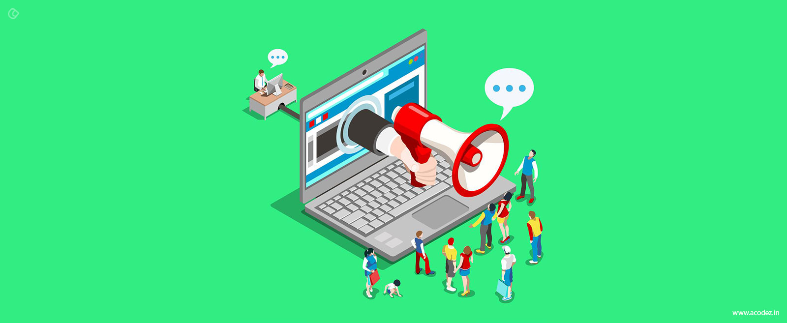
The moment we get that great idea to start our Start-up, the first thing that comes to mind is having a wonderful, clean and simple website, and that’s important too.
We are living in the digital age, the age of Websites, Apps, IoT, VR etc. Having digital presence helps us in creating our digital footprints, leaving our marks on the web, so that others looking for the product or service online can reach back to us.
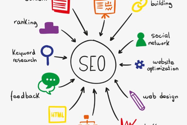
So, if you are planning to have your website, that is great. Though having a website and having a great website for your business are two different things. There are many points to discuss when it comes to it, though the one we will be discussing today will be – Information Overload.
According to research published by Blue Corona, 48% of people determine the credibility of a business by its website design.
Website planning is very important.
It starts with the finidng right domain name and hosting services first. I prefer and recommend using Bluehost for buying domains and hosting services for the website.
The planning of website helps us to conceptualize the idea, the layout, the UI and UX of it, the content planning and quantity of information we want to put on our website.
When it comes to putting information on their website, people tend to put all they could. They want their website to be loaded with every bit of information about their product or service, and here they make the mistake.
Having your website over-loaded with lots of information is not a good thing. If you are planning to do so, then stop right now.
It has been seen that the website with simple designs and clean structure wins have more conversion rate than the too much-cluttered design. In a study by Google in August of 2012, researchers found that not only will users judge websites as beautiful or not within 1/50th – 1/20th of a second, but also that “visually complex” websites are consistently rated as less beautiful than their simpler counterparts.
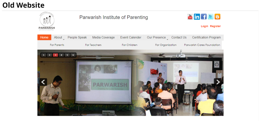
The New Clean and Simple Website
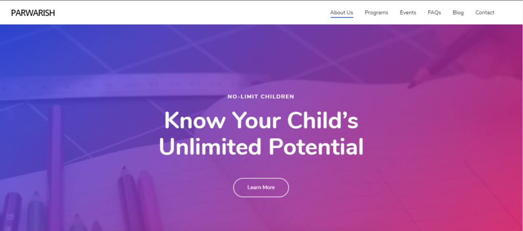
When it comes to UI UX of websites or Mobile or Webs Apps, all that users want is a clean, clear and well-organized UI. The website users want to find what they are looking for as quickly as possible without getting distracted. No one likes cluttered websites.
So, what are cluttered websites?
Cluttered websites are ones that lack visual order and information overload, thus increasing cognitive load as users struggle to parse the visual landscape and understand which parts are important.
And, why does it happen?
There are 3 main characteristics that cause a website to feel cluttered:
- There’s simply too much content (especially text) on the website screen.
- The content doesn’t seem organized in a logical and connected way.
- Use of too much of striking imagery and contrasts, causing visual noise.
If getting more conversion is your main goal, then the simple design can grow your conversion rate incredibly and users love simplicity.
There are many reasons why simple and clean designs win like fast loading speed, CTA is clear and easy to use, It’s easier for users to find what they are looking for.
navigation is easy throughout the whole website, and more importantly its less expensive compared to other designing work.
Also, when visitors land on a simple design website, they used to think that clean and simple website more trustworthy as they come with simple and formal structure.
Clean and Simple design can incredibly increase the rate of conversion as well as visitors experience. If you are having a clutter overwhelms website design, its time sit to redesign your website.
Also, if instead of many efforts your CTA is not going up, this could be the reason. So, make sure that you have a clean and simple website designed to increase your conversions.
Irrespective of your industry, you will be better served with a clean and Simple website.
Not only will it boost website conversions, but you will attract more people to the minimalistic, modern design.
It’s great that decluttering your website and cleaning up your layout is not very complicated. Look for pieces to remove and focus on simple shapes and white space.
In our upcoming posts, we will discuss more on :
“How to make a clean and simple website for better conversions” and
“Reasons to have A simple website”.
So, how will you simplify your website design? Share in comments.
Are you looking forward to Outsourcing Web Design and Development Services OR want us to manage your ‘Digital Presence’!
Call us at +91 9999 00 6474 & get in touch with our team right away!

